 For this map, I had to show wine consumption in Europe for 2005. The consumption data was provided in an Excel file and I used this to calculate the circle size by using the conventional mathematical scaling method. Creating the circle took some time and making sure I was placing them in the correct layer in Illustrator took some getting used to. I kept forgetting to make sure the circle layer was selected when creating them. Over all, I liked this assignment. Especially, since I'm getting used to Illustrator.
Sunday, February 28, 2010
Module 7 - Proportionate Symbol Mapping
 For this map, I had to show wine consumption in Europe for 2005. The consumption data was provided in an Excel file and I used this to calculate the circle size by using the conventional mathematical scaling method. Creating the circle took some time and making sure I was placing them in the correct layer in Illustrator took some getting used to. I kept forgetting to make sure the circle layer was selected when creating them. Over all, I liked this assignment. Especially, since I'm getting used to Illustrator.
Tuesday, February 23, 2010
Module 6 - Choropleth Mapping
 This map was created to show the population change percentage for the U.S states during 1990-2000. We were given the data and had to create a choropleth map using both ArcMap and Illustrator. I didn't have any issues with this assignment.
 This map was created using the first map as a base map. It shows the percentage change in population by Divisions. We were given an excel spreadsheet with the population for 1990 and 2000. With this information, we had to calculate the change in population and for each division. This took me the longest as I didn't understand how calculate even with provided equation. I finally separated the states by Division and figured it out.
 Sunday, February 14, 2010
Module 5: Map Composition
 The map above is showing the Hispanic population in the southern counties of Florida. This map was created using the Adobe Illustrator. I had an easier time working with the software this week compared to last weeks assignment. Adobe Illustrator, as with any new software, does take some time to get used to. I was having a hard time trying to figure out where to place all three maps but finally decided on a layout that I was happy with. I think what took me the longest on this assignment was what colors to choose.
Monday, February 8, 2010
Module 4 - Typography

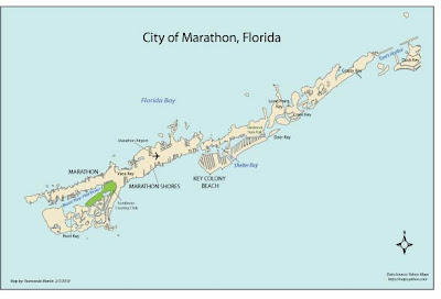
This was my first attempt at working with Adobe Illustrator and it sure was an expirence. I could not figure out how to crop so my map looks a bit small. I enjoyed the assignment but did not start having fun with the software until the very end (when I finally started to get used to it). Finding a good placement in the tight spaces, especially the bay and harbour areas, were a challange. Happy Mapping to everyone this week.
Monday, February 1, 2010
Data Classification Lab
Methods of Data Classification
% of African Americans in Escambia County

Above, I have placed four data classification methods all showing the percentage of African Americans in Escambia County.
The classification I think best represents the data given, is the Natural Break method because of its logical breaks. With the differences between the classes maximized, it gives a good display and makes it easy to interpret for this particular data set.

Subscribe to:
Comments (Atom)
