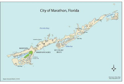
This was my first attempt at working with Adobe Illustrator and it sure was an expirence. I could not figure out how to crop so my map looks a bit small. I enjoyed the assignment but did not start having fun with the software until the very end (when I finally started to get used to it). Finding a good placement in the tight spaces, especially the bay and harbour areas, were a challange. Happy Mapping to everyone this week.

Good placement here! Like the varied text size and all caps vs non caps. Good color use as well. A+
ReplyDeleteVery nice!! Keep up the good work!
ReplyDelete